
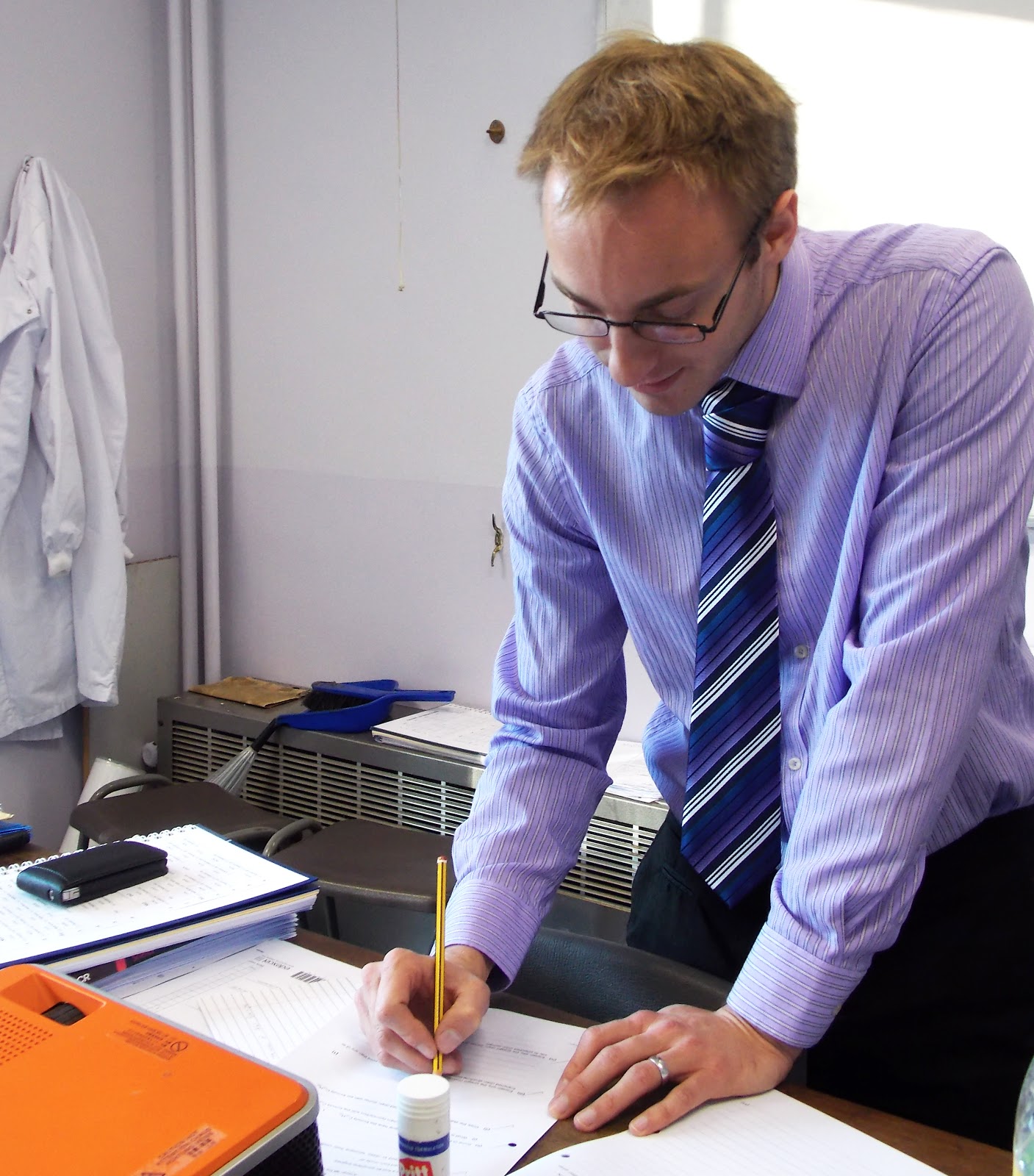
This is one of the images I have chosen to place on my contact page; I used a teacher in the image due to my magazine being one for a school. I chose a teacher that was dressed smartly and made him pose doing a typical class task. The lab coat in the background is effective because it balances the image.
How I edited this image:
I decided all three of my images were to be square to be visually symmetrical.
- I cropped the image and ensured I included the main aspects.
- I brightened the background to ensure the reflection provided shadowing to the rest of the image.
I feel this makes the image stand out in a brighter, eye catching way.
This advantages of this image is the story behind it, what it represents, the lighting and the position which after being cropped appears to be looking up to the teacher as he looks down.
The disadvantages of this image is the cluttered background and the sight of the phone which is innapropriate. I could have edited this out using the cloning tool and re-creating the wall to remove the sight of the heater and clutter on top of it; however i decided not to due to it resembling a real classroom which is what a school magazine would expect.


This second image i chose to include sixth formers in it due to my front cover including the younger years. I came to this decision because my contents page research included an image similar to this. I decided to have them on the computer with work next to them and a word document up to ensure the reality was included. I feel this represents what a school hopes for... hard working students.
How I edited this image:
I felt the board in the background was taking the eye off the main focus.
- Therefore i removed it by cloning the wall next to it and replacing the board with clear wall. This was successful and improved the image however the tops of the chairs have been affected; this doesnt become noticeable until the scale increases therefore due to the size of it on my magazine it isn't noticeable.
- I cropped the image to ensure it was a square of the same size as the previous one.
The advantages of this image is the set up of the computer and school work and the angle is at the height level of the students so the viewers are looking down at the computer as they are, this is complimenting both the image of work and the students.
The disadvantages of this image is the coats the sixth formers are wearing I would prefer them looking more professional to represent the school, the lighting is an issue and the yellow wall which is behind them is too similar to their skin. Therefore I couldnt alter the colours because it would have been unflattering.


I included an image of school girls around a display in the building, this ensures i have included three large aspects of school life: teachers, sixth formers and the younger years. This image represents students eager to participate in the activities of schools which is a good method of representing the school.
How I edited this image:
The door behind the girls heads was rather distracting therefore i removed it.
- I did this by cloning the wall behind them and zooming in on the image to ensure their heads were not affected.
I could partially see a person by the door.
- I cloned the wall and removed the small image of a person, i had to zoom in to ensure the girls hair was not affected.
- I cropped the image into a square to make the image clearer, cut out the bags and make it the same as the others.
- I increased the brightness slightly due to the removed door needing to fit in with the colours of the image, therefore I treated it as a light source to draw the eye into the image of the students. The advantages of this image is the girls having the correct uniform on; this is improved from my front cover because one girl had a coat on therefore I have improved my detail within the image. The story is successful because it incorporates the school building.
The disadvantage of this image is the bags on show, I cropped out as much as I could however they should have been out of the shot, also the girls shirt that is hanging out from her jumper isn't pleasing it draws the eye to it and away from the whole image. I would ensure next time all clothes are captured without flaws, including making her socks the same length because it once again draws attention off of the other parts of the image.
No comments:
Post a Comment