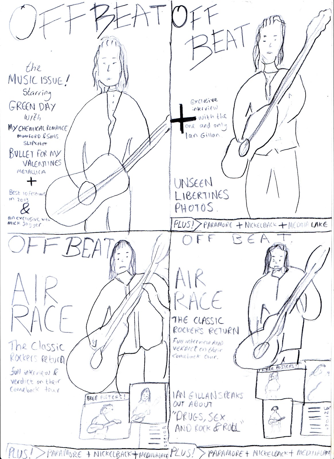
The title was more successful as a spread out word rather than having one word under the other.
The '+' sign was included in each drawing as from my research i had determined its place on my magazine however these designs showed the opportunites i had when using the '+' sign as it split up the information while being a nice feature.
The top two dont include other images as posters, i prefer the ones with posters therefore this helped me decide on incoporating more images on my front page as i had seen from my research.
I was split between the two layouts in my first and last drawing therefore my first and second draft will determine which one is the most successful when created.
This planning was successful as it helped me determine the best ideas and outline my final product so that i was aware of the direction i wanted my magazine to go in.
A good start to the research into ideas.
ReplyDelete