Cally Skinner

AS Media

Candidate number:

Sunday 20 January 2013

First draft and changing decisions

 This was my first draft of my music magazine however from my drawings i knew i had two options to fill the space with however the one i had thought i prefered doesnt work as well as the second option.

Therefore i decided to change it on my second draft.
 This is the area that isnt working; the writing isnt clear in representing the Rock genre as it is on my research. It uses too many words and not enough eye catching different fonts and sizes.
I decided to go back to my research to determine a better layout for my text, i used this as inspiration when creating my drawings therefore there is a clear relation to my research and my final design.

I will create a title like this instead because it is more powerful and more likely to be found on a rock magazine.

I will use these words in a similar format as Dean is part of the band Air Race therefore it is actually true.

The words are similar without copying to show the influence the research had on my design.

'AIR RACE
THE CLASSIC ROCKERS RETURN
Full interview and verdict on their comeback tour'


This is the final outcome, it is similar to my drawing and related to my research which is successful as the planning and research techniques benefit eachother. The mix of three colours is what i had planned in my research as most magazines use a three colour mix, therefore mine is similar to the magazines i researched.

The colours i chose reflect off the colours in the image as they are varied. This ensures the writing stands out.


Saturday 19 January 2013

Drawings of planning my front page

This is my drawings i used to plan my front cover image, i used the two best images from my shoot to be the main drawing however from comparing the first drawing to the second i prefer the guitar pointing to the corner therefore this helped me decide my main image.

The title was more successful as a spread out word rather than having one word under the other.

The '+' sign was included in each drawing as from my research i had determined its place on my magazine however these designs showed the opportunites i had when using the '+' sign as it split up the information while being a nice feature.

The top two dont include other images as posters, i prefer the ones with posters therefore this helped me decide on incoporating more images on my front page as i had seen from my research.

I was split between the two layouts in my first and last drawing therefore my first and second draft will determine which one is the most successful when created.

This planning was successful as it helped me determine the best ideas and outline my final product so that i was aware of the direction i wanted my magazine to go in.

Friday 18 January 2013

Layout Plan


This is part of my planning as i was determining where to allocate certain aspects of my magazine. this was used to determine where the title would be and how the posters would be arranged. the writing was then used to test the best position so that the image was corrupted.

I played around with a text box at the bottom to see if it would fill the page successfully or overcrowd it... i feel it is successful from seeing one version with it and one version without it.

This helped towards my final design as it helped me decide what my magazine should include and what ideas shouldnt be included. Therefore the planning stage contributes massively towards the final draft as it helps save time as you can discard any bad ideas before testing them out on your main front page.

Thursday 17 January 2013

My shoot analysed


Some of these images work better than others however at a concert its hard to capture the right image every time, the ones that do work are the ones that used extreme editing as the originals didn't appear successful however after editing they became my main images. Due to my model being controlled by his concerts i had only two days to capture my images as the concert was moving to Madrid. This was better than one day as i managed to get a change of clothes and a different scene in some of my images so that i got a type of second shoot. Therefore my research and preparation was crucial to capture the images correctly during the chances i had.

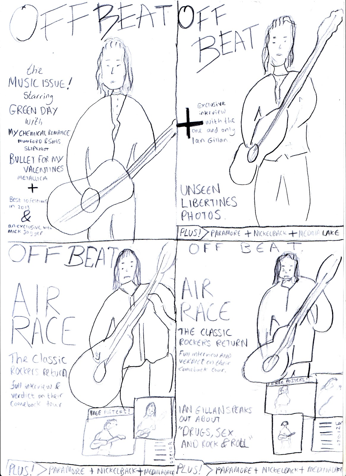
A selection of my photographs.
This doesn't work well as the blue tint is too powerful compared to the others where the colour tones benefits the image.


 This image isn't the right layout for my magazine and the bright light takes the eye away from the image which wouldn't be successful on a front page as the main focus is the artist. I feel the guitar isn't as focused as it should be, i plan for it to be more included in my image as my research shows.


This image is partially successful as the guitar and body is captured evenly, however to create a clearer image the colour tone had to be altered, therefore the increase in blue to make the clothes appear darker and remove the background made the image less successful as the colour tone is overpowering. However the facial expression and crazy facial hair is successful as from my research i knew to incorporate it to replicate the rock genre.


 This image was on the second set, his beard isn't as successful as it is plaited and less free, however this is successful as the background helps create a mood however for a front page it is too busy yet a two page spread would be sufficient as it includes more features. The lighting is good as the camera was already put into a black and white setting therefore the image was captured successfully using the camera's setting.

 This image is clear in the message it produces yet for a front page the face is too covered, as a moving image it will blur when made larger therefore my final image will need to be a large size with a correct zoom already. The colour tone is a bit too false as the light is reflecting off his face rather than reflecting behind him. Therefore part of his body is a different colour as the light is focusing on one half of his body.

 This image is successful in capturing a moment and introducing a mood however the image was changed in Photoshop as i changed it into a sepia effect. This altered the colour tones, the light is visible from the side of his body and the side of his face which overpower it slightly. The guitar is more involved yet the top of it is cut off which isn't as successful as i would of liked.


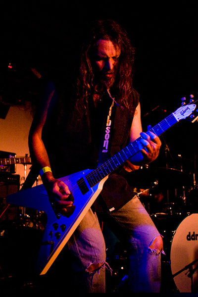
This is the original of my front page image as you can see the editing improved it by altering the colour tone it gave it a better feeling and clearer vibe. The original is quite bland yet it is successful as it is a crisp image with the light in a perfect position to ensure the facial features are illuminated not corrupted.
 This is the edited version it has a clear vibe and the guitar is prominent as i had planned, the moving image captures a moment and the editing allows the smoke and light to produce an eerie texture that makes it seem more dark and sinister... a tone common to the rock genre.

 As seen by the original the image is too red as the light was captured corrupting the features of my model. This needed editing to create more light on the face as his perfect expression is lost.
 This is the edited version; the face is clearer and the features are showing a message as it is truly capturing a moment that would make a person feel as if they are there. The image was put into an 'Old photo' setting to lower the red colour tone in the original. If the guitar was a bigger part of the image it would be more successful for my magazine front cover.


This original is again too red therefore i used the same methods as the previous image to remove the colour tone and replace it with a darker, sinister tone. The guitar is more prominent yet i feel the top part of the guitar is the best aspect, due to it being captured on a zoom setting his other arm has been removed which i feel isn't successful.

 This version is a large improvement the 'Old photo' editing option benefits it as the whole image becomes more eye catching. It is perfect in capturing a tone and a message of being free yet it isn't successful as a front page image due to his face being turned down.

This is the original of Deans band mate - i took these as i planned on including images for the front cover that promoted free posters inside. Therefore i included images of his band mates. The colour tone isn't obstructing yet the editing improved it.
This is the edited version i used an 'Old photo' effect as it was successful on the other shots. the light has been exposed to highlight the smoke behind him. This is a successful image improved using editing methods that really create a tone and message, however it isn't as 'ROCK' as Deans as his beard and hair is more controlled... it has more of a folk theme to it, however for a small feature on the front page it will be successful.

Thursday 10 January 2013

Photoshop edits.


Original image.
 

 I started by changing the photo into an 'old photo' effect to create an eerie tone that highlights the smoke and lighting as the image would benefit from using the setting as part of the photo.


I then changd the 'brightness and contrast' to improve the shadows and colour tones, this gave more colour to the light behind him which in turn illuminated him as it drew in the focus from the viewer.

I then altered the exposure so that the face was clearer and the background smoke was clearer. This lightened the image without altering the tone.
I then altered the brightness and contrast once again to ensure the colour tones were a mixture of bright and dark so that certain aspects were illuminated.


This is my final image, i altered the contrast and exposure slightly once again just to magnify the white light behind him to make it more prominent, this then highlighted the old photo effect put on it as the shades of grey became clearer.


Wednesday 9 January 2013

Photoshop print screen of main image


Due to the size of my image my title would obstruct the head of my model, therefore i used Photoshop to create more space for the title. I did this by recreating the top of the image and copying and pasting them at the top of the image. This created more space between the top of the head and the top of the magazine.

I then used the Clone tool to blur the edges and remove the faint visible lines by merging the colours together and adding more shades so that it isnt obvious the top has been created.

Tuesday 8 January 2013

Print screens of chosen image


This is the original image i have decided to use as my front cover however i needed to edit it due to the bland colours that dont represent the atmosphere as i had planned. Therefore i used Pixlr to alter the colour tones to produce vibrant lighting that attracts the reader to the image.
I altered the colour balance by changing the offset so that the green tone was present to give the image a visible atmosphere. This helped improve the image as it is more eye catching.


I altered the hue and saturation to create more attention on the light in the top corner. This then gave the image more shadowing and created more shades to improve the different tones in the image.


The last step was changing the colour vibrance to make the image for vibrant as it needs to stand out and be similar to images used on front pages.


This is my final image, it has drastically improved from the original and has become more alive as it captures what the audience would see as the lighting represents the atmosphere of the concert. Therefore the moving image was successfully captured and has had the light improve it rather than corrupt it as i had hoped for in my planning.

This image is now able to be used as a front cover image as it is similar to professional shots taking in the magazines i have researched.

Monday 7 January 2013

Title written research


I started my font research by creating an array of examples in some of my favoured fonts. I then chose the ones that complimented the word the best and related to the visual aspect the word produces.

‘OFFBEAT’ feels like a hard syllable word due to the ‘BEAT’ inside it, therefore it had to be a bold font with possibly bold letters to represent the tone of the word. I chose capital letters for it as it is a powerful meaning and should represent a vibe for the magazine.

Once I had an overview of various fonts I chose my favourites to increase the size and manipulate the colours to determine an idea to follow that would relate to my music magazine the best. The larger size of the ‘O’ and ‘B’ gives the title increased depth however I determined through this research that the word ‘BEAT’ should have as much effect as the rest of the word and the larger letters removes some of the attention on the words.


I decided to follow the idea of colour within the title as the magazines I researched mostly used coloured titles as their images were quite dark due to the rock genre. The colours I manipulated gave a sense of the word as I had aimed for however the colours were too false and made the title begin to look unprofessional and graffiti-like which isn’t the title I was aiming for.

I removed colour from the words and focused on the colour black yet edited it to fade out, I feel the effect is successful however on a front cover the image could obstruct it and make the title unreadable which wouldn’t be a success as it is a main feature of a magazine. 

The editing began to make the word unreadable therefore I changed the direction of blur and added a line to help show the reader where the word ends to make the title have a bigger impact visually.


These 4 examples show the process it took for me to get to my final choice, it identifies the decisions I made and the changes which helped me decide the best outcome. I tried many options however this one I feel achieves the best title for a rock music magazine.

I kept the ‘O’ and ‘B’ bigger as I discovered in my previous designs however I also maximised the size of the other letters so that they appeared better alongside the ‘O’ and ‘B’ this is an example of successful research as a change I made on a whim became incorporated in my final design.

I liked the change in colour as the letters go on however I chose the solid bold version as the colour tone of my image was unknown therefore it needs to stand out.

The font and increased tilt I used illustrates the tone of the word and relates the title with the font which is successful and was one of my main targets.  As shown as the version at the top I have changed the initial one a lot and then returned back to a similar version for my main one.


During the process of making my front cover I decided the font didn’t fit with the tone and the main image therefore I went back to my previous design and altered the font, angles and size to generate the tone of rock as I had tried to do before.

I changed my font to Calisto MT and changed the tilt to 45 degrees and change the width to 25 this made it larger and more spread out to use the empty space on the magazine. The angle was changed to be in line with the guitar so that it is visually pleasing and all in line.

This decision was made as my previous final design appeared graffitti-like when placed on the magazine. I thought it appeared rocky due to the varied angles of the letters and the bold font, however it appeared unprofessional as it didnt suit the tone of my main image. I feel the image of a solo artist needed a large title to fill the space, however my initial design was small to fit in the corner therefore it wasnt responding to the visual needs of the magazine.


This changed from my research as I had planned to use a corner title such as the magazine ‘NME’ however I did research magazines such as ‘Kerrang!’ and ‘Classic Rock’ that had titles take up the whole width of the magazine. Therefore my research helped me perfect my title and showed me that wide research allows my work to change if my first idea doesn’t work.

The final title is successful as it stands out on a dark background and is sharp and direct as rock music is without being too perfect and in place due to the erratic tone the rock genre should generate.

Sunday 6 January 2013

Photography preparation

As an A Level Photography student I am aware of the importance of planning when considering a photo shoot in order to gain the best images possible. My Photography knowledge gathered from my AS Level will enable me to take high quality images.


1.
     
Getting started.

The problem in these small venues is in the lack of stage light! Most of the concerts have only a blue and a red spotlight on stage. Therefore the light must be Incorporated into the photo to create an atmosphere instead of corrupting the image.


2. Buy a fast cheap prime lens.

For concert photography use fast lenses.

Most of the time the stage light is very low so your only chance to get sharp images is to use a fast lens.

The 50mm 1.8 would be successful because of its ability to shoot in low light at its lowest aperture setting. For small stages a 50mm lens is a good compromise to get a head shot of the lead singer and a full length shot of the drummer.

3. What was this noise all about?

One important setting on the camera is the ISO value. A good setting for the camera’s ISO value is crucial for concert photography. Most of the time your ISO setting will be up to 1600 or higher to get a decent shutter speed.

Using such high ISO settings at a digital SLRs with a crop sensor will generate a lot of noise. Therefore I recommend to use noise reduction software in your post processing work flow. (This refers to the brightness of the image and the detail in the background.)

4. Which Mode and Settings to shoot with?

I shoot in Aperture priority mode and at my lowest aperture setting (e.g 1.8; 2.8, depending on the lens you are using).

Some people also use manual mode.

I always use spot metering, because the stage lights are changing rapidly and you’ll never know if the lights will hit the artists face in the next second or not.

Use multi shot mode. Do not only shoot 1 picture but 3 or 4 to have a higher yield of pictures that you can use.

Finally: Always shoot in RAW format to have the ability to change all the parameter like white balance and exposure afterwards in post processing.

 5. What about Shooting in Big venues?

Depending on the artist, you are allowed to take pictures of the first 3 songs without flash. Not more. These are the rules and everybody has to stick to it.

6. Camera size?

Bigger Venues need bigger lenses and mostly high ISO too.

Professional concert photographers have a full format sensor camera (because of the high ISO capability) and a 24-70 2.8 or 70-200 2.8 or both – or even an ultrawide angle/fisheye lens.

On big stages you definitely need a telephoto lens. The zoom ability is also crucial, because you can not move forward, so you have to compose from your point of view.


This research helped me prepare for my shoot so that my photographs were successful and the camera was set up correctly. This also showed my knowledge of photography.

Saturday 5 January 2013

Research into my model

Dean Howard

Dean Howard is my uncle, he was previously in the band T’PAU signed to the record company ‘Siren’ part of the Richard Branson’s Virgin international record company.
He joined the pop/rock band T’PAU, fronted by the singer Carol Decker in the 1980’s.

Dean added a more heavy rock style of guitar work which was first featured on the re-recording of one of the tracks from Bridge of Spies, "
China in Your Hand". This subsequently stayed at number one in the UK single charts for five weeks and was the band's biggest hit. He remained lead guitarist on the group's next two albums, Rage and The Promise
.

Dean was then part of
Ian Gillan
's backing band on the Deep Purple frontman's U.S. solo tour in August and September 2006. Dean was working with Toby Jepson (ex Little Angels), and is now with classic rock band Air Race.Due to my music magazine being created around the rock genre I decided to use my uncle as the model for my front page as his fashion and visual aspect represents the rock music I researched. I could also capture moving images of him on stage as he performs in many concerts therefore the images would be similar to those in my research and professional enough to fit in with the tone of a music magazine.

Thursday 3 January 2013

Picture research


This photograph is pretty stationary as if he has stopped to pose for the image, it isn’t capturing a moment or a moving image therefore the atmosphere can not be felt through the image.

Making the photo black and white benefits the image as his white shirt and dark guitar contrast each other successfully. The shadows and glimpse of objects in the background produces curiosity without obstructing the main focus. This editing ensures the model isn’t lost within the background of the picture.

The clothes relate to the rock genre due to the chains and how the shirt is done up. However I feel the glasses are unsuccessful as they don’t fit the rest of the image, they make the model look out of place within the scene he’s in. I feel from my research I would prefer an old rock star with facial hair as that to me produces the rock genre more than this clean shaven young man.

I feel this would suit a magazine cover due to the layout and position of it as writing could go down the left side without covering the image however I wanted to capture a photo that seemed un posed and un planned – literally capturing a moment that was as unexpected to the photographer as it would be to the reader.


These images show an old rock star as I had planned for my own images, the beard and long hair is similar to that of my models. Once again the models tattoos and clothing promotes the rock genre and the atmosphere of the magazine.

The lighting is successful as the editing is subtle and works on the colours of the image rather than drastically change it. The lighting in the one with the blue tint is successful as the lighting is known to be obscure at concerts therefore it feels more realistic now.

The position is successful of each as the
mic doesn’t obstruct the face, and the facial features are clear. The blue one uses the angle as if looking up to the performer which is what people would do when he is on stage therefore making the viewer feel part of the image.


The images are successful  and would benefit the magazine as the layout could go down the side of each as there is room without obstructing main aspects of the images. There are corners available for the title and clear enough colours to produce a layout with different colours that stand out against the images.


This image is similar to how I feel my own would turn out as the lights on stage effects the lighting captured. However this image shows how the colour can benefit the image as his clothes are similar colours and black and white wouldn’t suit the image as the shadows would be lost along with the atmosphere captured.

This image uses colour to benefit it as the lights show how the purple is what you would have seen if at the concert, this is better than editing it to be black and white as people would see this image as it is if present at the concert not black and white.

The guitar and facial expression promotes a moment being captured as it isn’t staged or posed it is a spur of the moment shot which generates a message of its own. The shadows are successful as the image feels more pure and professional.
The angle and position is successful as the
mic doesn’t obstruct his face and the lighting doesn’t over expose the image as it is behind him.
This would be a good front cover image however the layout of it is the problem as it isn’t long enough to fill the wide space of a magazine without obstructing the image by stretching it. Therefore this shows the importance of the size as it needs to fit a magazines front page.


This photo is capturing a moment similar to what I would like to do, the angle allows the background to produce an atmosphere without over crowding the main aspect. The angle allows the face to be backed onto the black area which benefits the photo as in front of the bright orange may distort the exposure of the image.

The position of the model is successful as the guitar is a main feature as I had planned for within my research. The tattoos, clothing and appearance gives the message of a rock star. His tattoos and skull ring promotes a stereotypical idea of rock stars which improves this photo as it achieves an audience visually as people relate to the rock star image and understand what the magazine will entail.

I feel this wouldn’t be a successful front cover image as the position and angle benefits the photo however it wouldn’t benefit the layout as their isn’t enough room around the photo to include the information therefore the image would be obstructed if you tried to include headlines and titles.